The Cash Position, on a Screen Nobody Has to Ask For
The most expensive question in a small business
"How much cash do we have?"
It gets asked most days, by someone who needs a rough answer to make a small decision — can we pay this supplier now, can we take the delivery, is this a good week to order stock. And in most businesses it gets answered by interrupting the one person who knows where the sheets are.
That person opens a workbook, applies a filter, reads a total, and says a number out loud. The number is usually right. It is also undated, unsourced, and immediately stale, and the whole exchange costs two people a few minutes each, several times a week.
The instinct is to fix this by giving more people access to the sheet. That is the wrong fix, and most owners feel the wrongness before they can articulate it: the people asking the question do not need to see individual petty cash entries, staff names, or supplier terms. They need one number, current, without a conversation.
A dashboard is the right shape for that, and dashboards in Workbooks are built to be handed out rather than logged into.
Dashboards sit above the workbooks
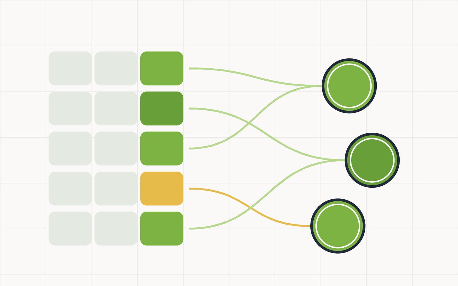
The first structural thing to know: dashboards live at the workspace level, not inside a workbook. One dashboard can draw from any worksheet in any workbook you have.
That matters because cash never lives in one sheet. The drawer counts are in one workbook, petty cash in another, the cash book in a third. A dashboard that could only read its own workbook would force you to consolidate everything into one giant worksheet just to see it together — which is how spreadsheets become unmaintainable in the first place.
Each widget points at a worksheet and a configuration: which column to aggregate, how to group it, which rows to count. The data is computed on the server when the dashboard loads, so what you are looking at reflects the current rows rather than a snapshot from whenever someone last refreshed something.
Six widget types, and what each is actually for
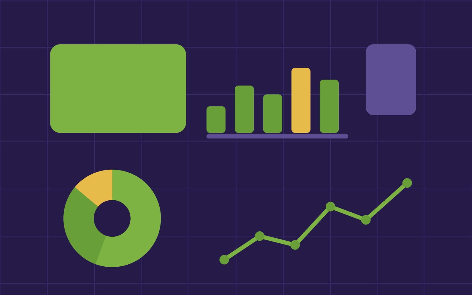
| Widget | Shows | Use it for |
|---|---|---|
| Metric | One big number — a sum, average or count over a column | Cash on hand. Entries this month. Average ticket. The number people are actually asking for. |
| Bar chart | Values grouped by a column | Spend per category, totals per location, counts per person. |
| Pie chart | Share of a total by group | Where the petty cash actually goes — the answer is rarely what anyone guesses. |
| Line chart | A value over time, using a date column | Balance trend. The direction matters more than any single day's figure. |
| Table | A live excerpt of a worksheet | The ten most recent entries — enough context to make the metric believable. |
| Text | A free-text block | Headings, notes, and the sentence explaining what the number above it means. |
The text widget is the one people skip and then wish they had used. A dashboard read by someone who did not build it needs a line saying what "cash on hand" includes — floats? uncounted drawers? — or you have replaced one ambiguous verbal answer with one ambiguous visual one.
A cash dashboard worth building
If you want a concrete starting layout, this one covers the common questions in six widgets:
- Metric: cash on hand. Sum of the balance column across your cash book. The headline.
- Metric: unreconciled entries. A count, filtered to unchecked. This is a health indicator — if it climbs, the headline number is getting less trustworthy.
- Line: balance over 90 days. Direction and volatility, which is what actually informs "can we pay this now".
- Pie: spend by category, this month. The conversation-starter. Categories only work here if they are a closed list — which is the argument for making Category a relation or select column rather than free text.
- Bar: over/short by shift. Straight from your daily cash count sheets. Small overs and shorts are normal; a bar that leans consistently one way on one shift is information.
- Table: last ten movements. So the numbers above have visible evidence underneath them.
Widgets are added from the dashboard's Add widget button, reordered by dragging, and edited in place — change the source, the aggregation or the title and the chart redraws immediately. The layout is saved for everyone, so there is one arrangement rather than one per viewer.
The public link is the part that removes the interruption
A dashboard can be shared with a public link, and the security model behind it is the reason this works as a control rather than a leak.
Visitors to that link see the computed widget data only. Charts and numbers. Not the underlying worksheets, not the rows those numbers came from, not anything they can edit. The aggregate is public; the detail is not.
That distinction is what makes it safe to put a cash-position dashboard in front of people who should see the position but not the ledger — a business partner, an investor during a raise, a landlord assessing covenant compliance, a manager at a location who needs the group picture without seeing individual staff entries. Revoke the link and access is cut off immediately.
It is worth being deliberate here rather than casual: a public link is public. Anyone holding the URL can load it. The right mental model is a read-only summary you are willing to have forwarded, because eventually it will be. For anything narrower than that, give people a workspace account and use saved views instead.
When a widget breaks, it says so
One design decision worth calling out, because it is the kind of thing you only appreciate after being burned by the alternative.
If a widget's referenced column or worksheet is later deleted, the widget shows an error state rather than stale numbers. It does not quietly keep displaying the last value it knew, and it does not silently fall back to zero.
This is the correct behaviour and it is not universal. A dashboard that shows a confidently wrong number is worse than one that shows nothing, because nothing prompts a question and a wrong number prompts a decision. Edit the widget to point somewhere current and it resumes.
Choose the aggregation before you choose the chart
Most bad dashboards are not badly designed. They are correctly drawn pictures of the wrong calculation, and the error is almost always in the aggregation rather than the visualisation.
Three checks catch nearly all of it.
Sum or count? A metric summing an Amount column and a metric counting rows answer different questions and often get the same title. "Petty cash this month" could be $840 or 23 entries. Put the unit in the widget title and the ambiguity disappears.
Are you double-counting a movement? If your cash book carries both Debit and Credit columns, a sum over one of them is not the net position — it is half of it. The Net formula column exists precisely so the dashboard has one unambiguous thing to aggregate. Point the widget at the computed column, not its inputs.
Does the filter match the question? A pie of spend by category over all time looks almost identical to one over this month, and tells you something completely different. Date-bound every widget that is meant to describe a period, and say the period in the title.
None of this is exotic. It is just the part that gets skipped, because a chart that renders feels finished.
What this replaces
Not a report. Reports are fine and you will still want them at period end.
What a live dashboard replaces is the interruption — the small, constant tax of being the only person who can answer a routine question. That tax is invisible in any process document and enormous in practice, and it falls hardest on whoever knows the systems best, which is usually the person whose time is worth the most.
Put the six widgets up, send the link to the three people who ask most often, and count how many times you get asked in the following fortnight. That number is the feature.
Dashboards and public links are included on every plan, including Free — plans differ in capacity, not capability. Build one at app.cashsheet.com.